FILL IN THE BLANK - (Topic 4)
The table has the following columns.
You need to add a column that will be used to sort the Year Month column chronologically.
Solution:
Answer as.
Does this meet the goal?
Correct Answer:
A
- (Topic 4)
You import two Microsoft Excel tables named Customer and Address into Power Query Customer contains the following columns:
• Customer ID
• Customer Name
• Phone
• Email Address
• Address ID
Address contains the following columns:
• Address ID
• Address Line 1
• Address Line 2
• City
• State/Region
• Country
• Postal Code
Each Customer ID represents a unique customer m the Customer table. Each Address ID represents a unique address m the Address table. You need to create a query that has one row per customer. Each row must contain City. State/Region, and Country for each customer. What should you do?
Correct Answer:
D
HOTSPOT - (Topic 4)
Correct Answer:
A - (Topic 4)
Correct Answer:
C - (Topic 4)
Correct Answer:
C
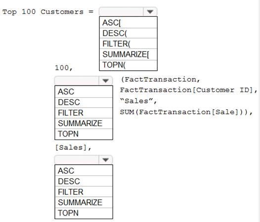
You have a Power BI report.
You need to create a calculated table to return the 100 highest spending customers.
How should you complete the DAX expression? To answer, select the appropriate options in the answer area.
NOTE: Each correct selection is worth one point.
Solution:
Box 1: TOPN
TOPN returns the top N rows of the specified table.
Box 2: SUMMARIZE
SUMMARIZE returns a summary table for the requested totals over a set of groups.
Box 3: DESC
Sort in descending order.
It is last in the TOPN command. TOPN syntax:
TOPN(,
Does this meet the goal?
You need to create a Power BI theme that will be used in multiple reports. The theme will include corporate branding for font size, color, and bar chart formatting.
What should you do?
You have a Power Bl report hosted on powerbi.com that displays expenses by department for department managers.
The report contains a line chart that shows expenses by month.
You need to enable users to choose between viewing the report as a line chart or a column chart. The solution must minimize development and maintenance effort.
What should you do?