- (Topic 4)
What should you do to address the existing environment data concerns?
Correct Answer:
B
DRAG DROP - (Topic 4)
You have a Microsoft Excel spreadsheet that contains the data shown in the following table.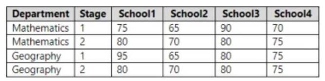
You plan to build a data model for a Power Bl report.
You need to prepare the data so that it is available to the model in the format shown in the following table.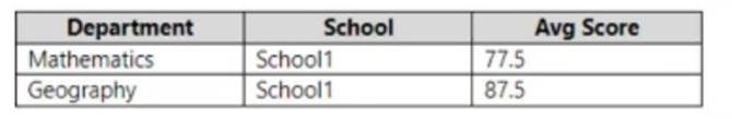
Which three actions should you perform in sequence in Power Query Editor? To answer, move the appropriate actions from the list of actions to the answer area and arrange them in the correct order.
Solution: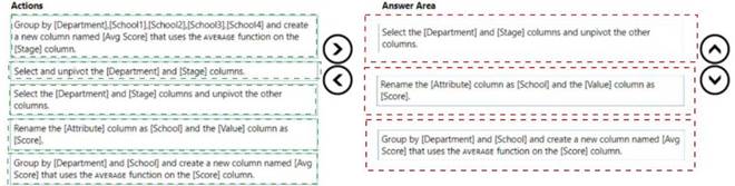
Does this meet the goal?
Correct Answer:
A
- (Topic 3)
You need to create the On-Time Shipping report. The report must include a visualization that shows the percentage of late orders.
Which type of visualization should you create?
Correct Answer:
A
Scenario: The On-Time Shipping report will show the following metrics for a selected shipping month or quarter:
The percentage of orders that were shipped late by country and shipping region
Customers that had multiple late shipments during the last quarter
Note: Bar and column charts are some of the most widely used visualization charts in Power BI. They can be used for one or multiple categories. Both these chart types represent data with rectangular bars, where the size of the bar is proportional to the magnitude of data values.
The difference between the two is that if the rectangles are stacked horizontally, it is called a bar chart. If the rectangles are vertically aligned, it is called a column chart.
Reference:
https://www.pluralsight.com/guides/bar-and-column-charts-in-power-bi
- (Topic 4)
Note: This question is part of a series of questions that use the same scenario. For your convenience, the scenario is repeated in each question. Each question presents a different goal and answer choices, but the text of the scenario is the same in each question in this series.
You have a Microsoft SQL Server database that contains the following tables.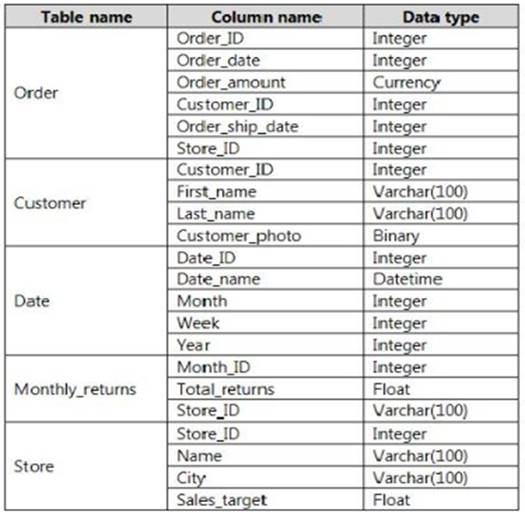
The following columns contain date information:
- Date[Month] in the mmyyyy format
- Date[Date_ID] in the ddmmyyyy format
- Date[Date_name] in the mm/dd/yyyy format
- Monthly_returns[Month_ID] in the mmyyyy format The Order table contains more than one million rows.
The Store table has a relationship to the Monthly_returns table on the Store_ID column. This is the only relationship between the tables.
You plan to use Power BI Desktop to create an analytics solution for the data.
You need to create a relationship between the Order table and the Store table on the
Store_ID column.
What should you do before you create the relationship?
Correct Answer:
C
- (Topic 4)
Note: This question is part of a series of questions that present the same scenario. Each question in the series contains a unique solution that might meet the stated goals. Some question sets might have more than one correct solution, while others might not have a correct solution.
After you answer a question in this scenario, you will NOT be able to return to it. As a result, these questions will not appear in the review screen.
You have a clustered bar chart that contains a measure named Salary as the value and a field named Employee as the axis. Salary is present in the data as numerical amount representing US dollars.
You need to create a reference line to show which employees are above the median salary.
Solution: You create a percentile line by using the Salary measure and set the percentile to 50%.
Does this meet the goal?
Correct Answer:
A
The 50th percentile is also known as the median or middle value where 50 percent of observations fall below.
Reference:
https://dash-intel.com/powerbi/statistical_functions_percentile.php