HOTSPOT - (Topic 4)
You are using Power Bi Desktop to connect to an Azure SQL database The connection is configured as shown in the following exhibit.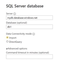

Use the drop-down menus to select the answer choice that completes each statement based on the information presented in the graphic NOTE: Each correct solution is worth one point
Solution:
https://docs.microsoft.com/en-us/power-query/connectors/azuresqldatabase
The following table lists all of the advanced options you can set in Power Query Desktop and Power Query Online.
Advanced option Description
Command timeout in minutes
If your connection lasts longer than 10 minutes (the default timeout), you can enter another value in minutes to keep the connection open longer. This option is only available in Power Query Desktop.
SQL statement
For information, go to Import data from a database using native database query. Include relationship columns
If checked, includes columns that might have relationships to other tables. If this box is cleared, you won’t see those columns.
Navigate using full hierarchy
If checked, the navigator displays the complete hierarchy of tables in the database you're connecting to. If cleared, the navigator displays only the tables whose columns and rows contain data.
Enable SQL Server Failover support
If checked, when a node in the Azure SQL failover group isn't available, Power Query moves from that node to another when failover occurs. If cleared, no failover occurs.
Does this meet the goal?
Correct Answer:
A
DRAG DROP - (Topic 4)
You have the Power BI data model shown in the following exhibit.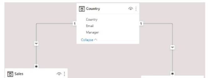
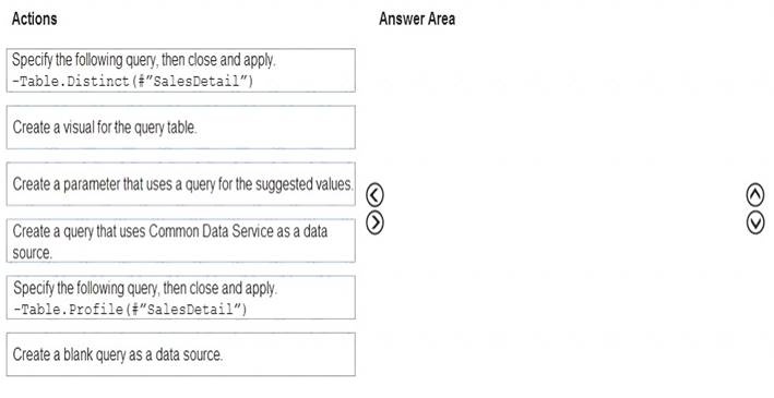
Solution: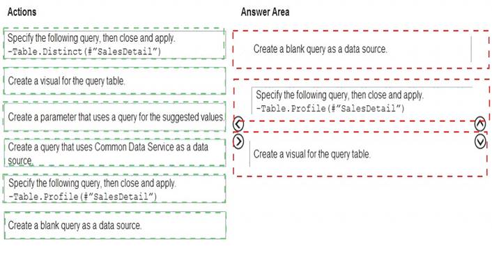
Does this meet the goal?
Correct Answer:
A
HOTSPOT - (Topic 4)
You have a Power BI model that contains a table named Sales and a related date table. Sales contains a measure named Total Sales You need to create a measure that calculates the total sales from the equivalent month of the previous year.
How should you complete the calculation? To answer, select the appropriate options in the answer area
NOTE: Each correct selection is worth one point.
Solution: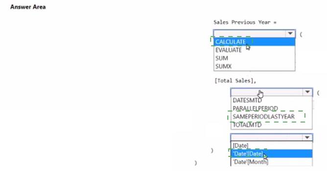
Does this meet the goal?
Correct Answer:
A
DRAG DROP - (Topic 4)
You are using existing reports to build a dashboard that will be viewed frequently in portrait mode on mobile phones.
You need to build the dashboard.
Which four actions should you perform in sequence? To answer, move the appropriate actions from the list of actions to the answer area and arrange them in the correct order.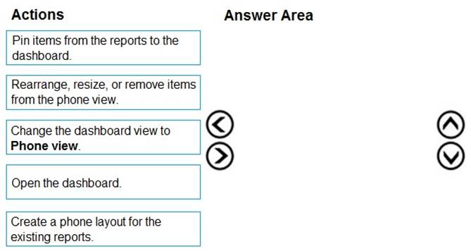
Solution: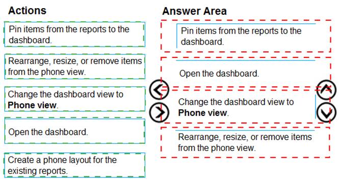
Does this meet the goal?
Correct Answer:
A
- (Topic 4)
A manager can represent only a single country.
You need to use row-level security (RLS) to meet the following requirements: The managers must only see the data of their respective country.
The number of RLS roles must be minimized.
Which two actions should you perform? Each correct answer presents a complete solution. NOTE: Each correct selection is worth one point.
Correct Answer:
AC
In Power BI Service the username and userprincipalname both return the email address, it's only in Power BI Desktop that username is domain/username rather than the email address. So I agree that userprincipalname is better generally as you always get the same value, the answer is correct and you can use username as your RLS since the role will be applied in the Service. See https://community.powerbi.com/t5/Community- Blog/USERNAME-v-s-USERPRINCIPALNAME-in-RLS-for-Power-BI-Embedded/ba- p/1867670 for more information.